この記事は最終更新から1年以上経過しています。現在の仕様や情報と異なる場合がありますので、ご注意ください。
Bootstrap Ver 5.xを使用してレスポンシブに対応したYoutube を埋め込む方法をご紹介します。
Youtube動画を埋め込む方法
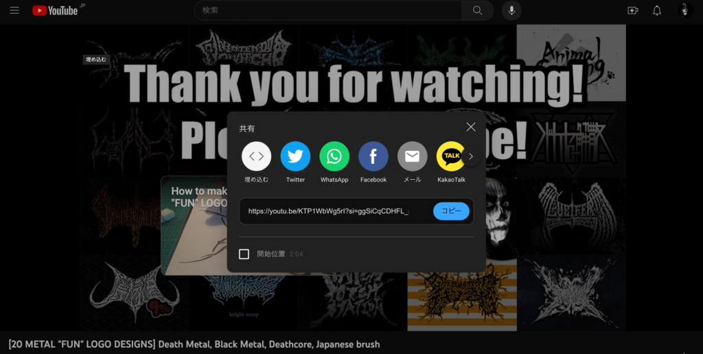
まずはYoutubeから埋め込みたい動画のソースを取得します。
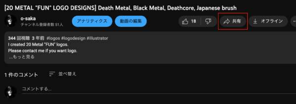
「共有」をクリック。
「埋め込む」をクリック。

ソースをコピー。
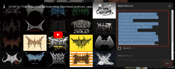
まんま貼り付けると下記のようになります。(わかりやすいように改行しています。)
html
<iframe width="560" height="315" src="https://www.youtube.com/embed/***********&controls=0" title="YouTube video player" frameborder="0" allow="accelerometer; autoplay; clipboard-write; encrypted-media; gyroscope; picture-in-picture; web-share" allowfullscreen ></iframe>
埋め込んだYoutube動画をレスポンシブに対応する方法
埋め込んだ動画をレスポンシブに対応するには下記のように変更します。divで囲ってクラスに「ratio ratio-16×9」を指定します。さらにiframeにスタイル「max-width: 100%; height: 100%」を適用します。
html
<divclass="ratio ratio-16x9"> <iframe style="max-width: 100%; height: 100%" width="560" height="315" src="https://www.youtube.com/embed/***********&controls=0" title="YouTube video player" frameborder="0" allow="accelerometer; autoplay; clipboard-write; encrypted-media; gyroscope; picture-in-picture; web-share" allowfullscreen ></iframe> </div>
以上で完了です。